Spilt Milk (Case Study)
A visual identity for Spilt Milk – introducing a Korean parenting essential to North American audiences.

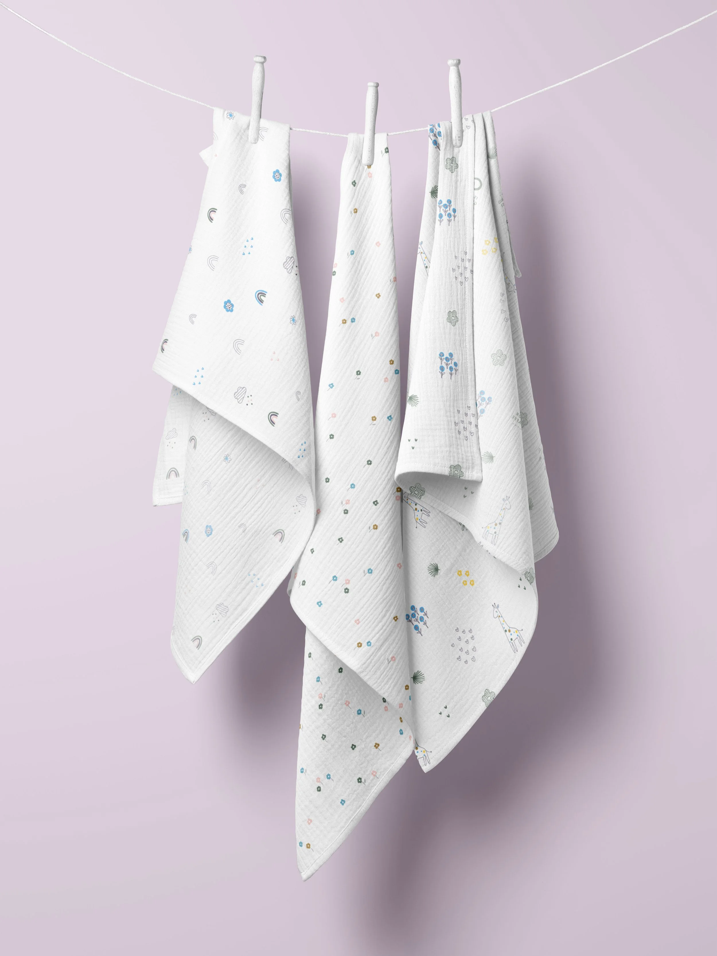
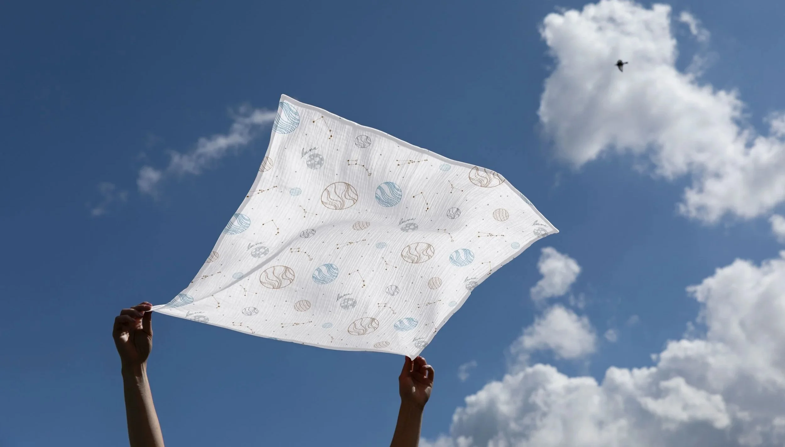
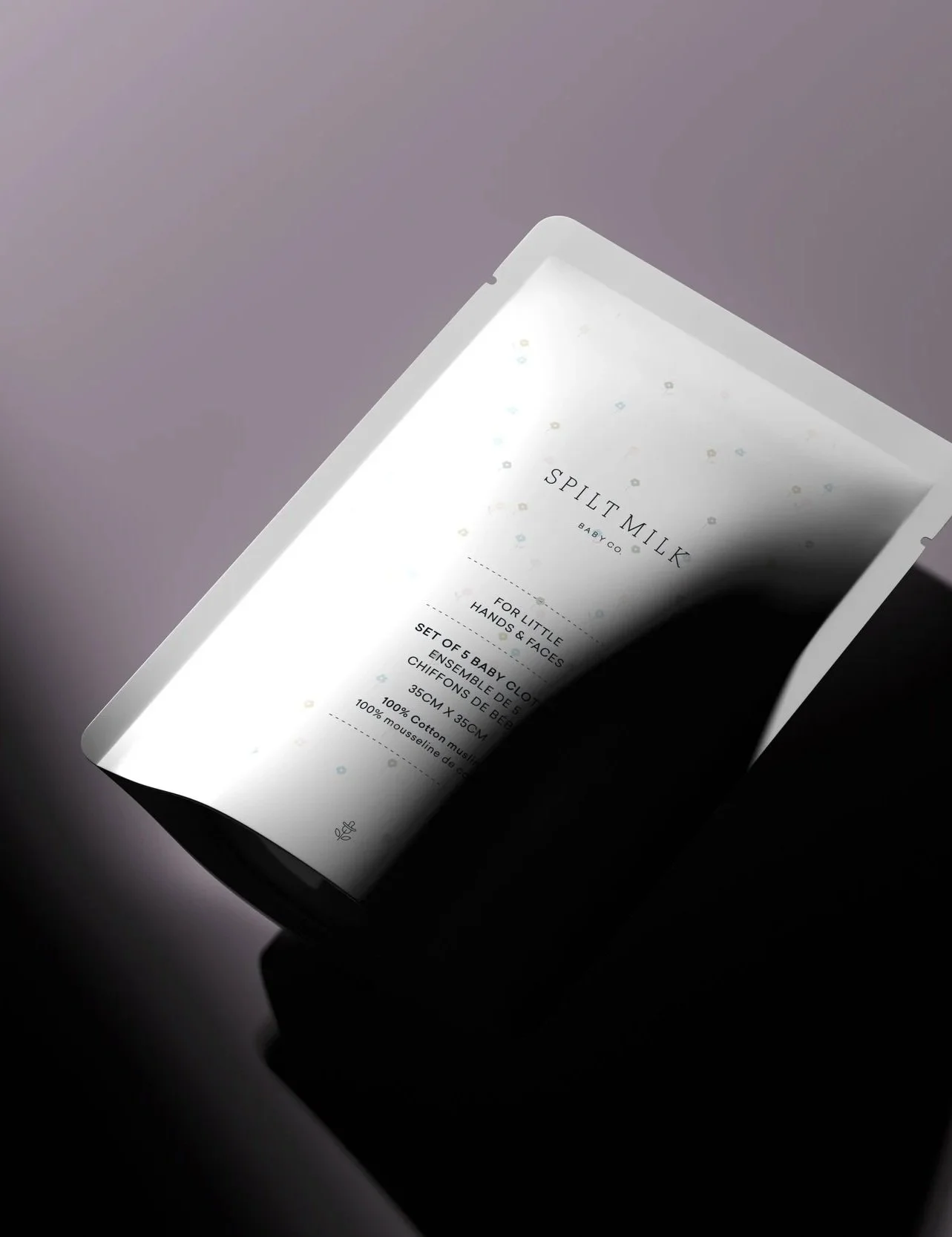
Spilt Milk brings the trusted 100% cotton gauze baby towel — long favoured by Korean parents — to North America. It combines everyday practicality with a clean, modern look that resonates with today’s parents and thoughtful retailers.
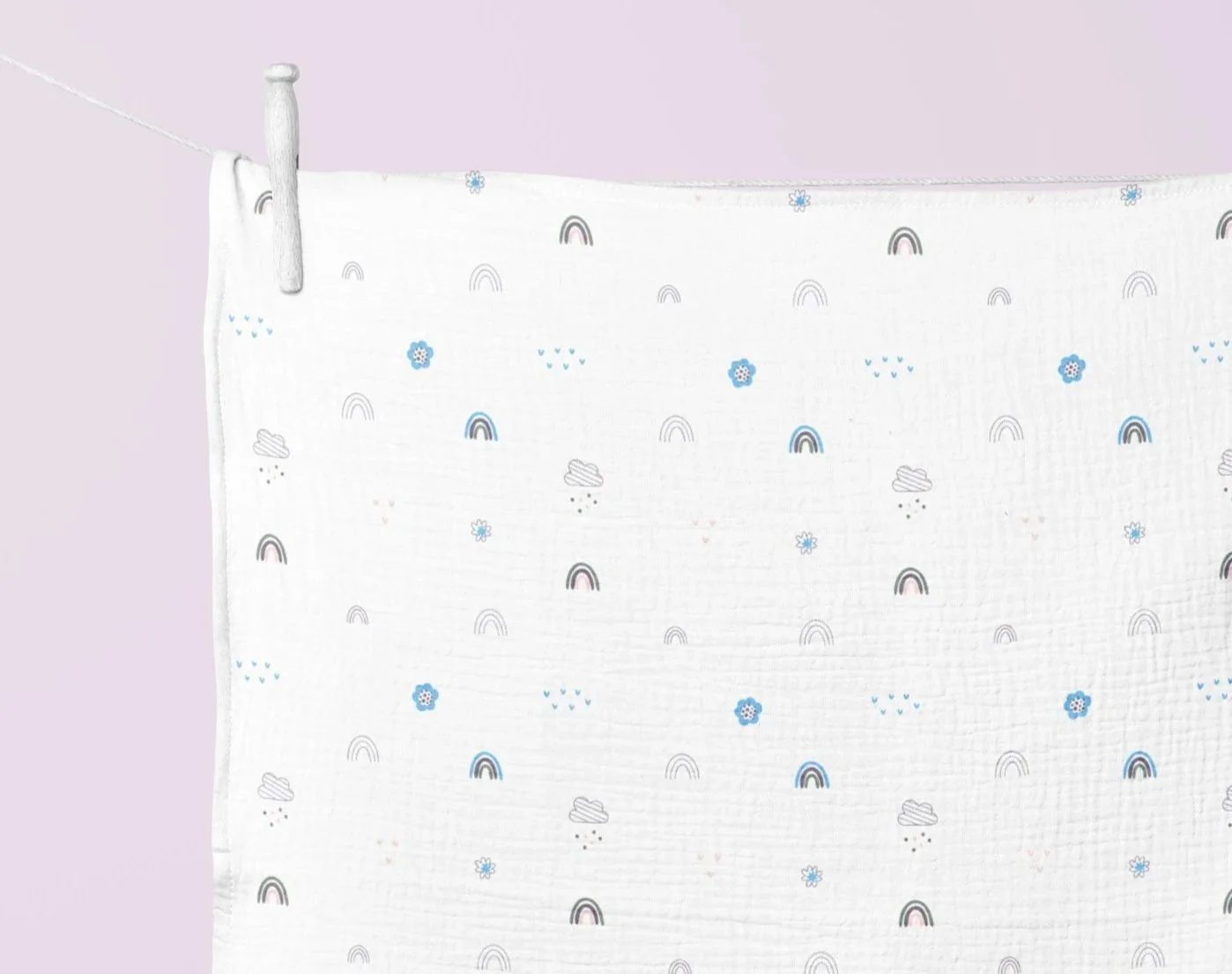
Colour, texture, and a sense of play were all thoughtfully considered in developing the patterns. Each design was crafted to strike a balance between visual charm and everyday usability.
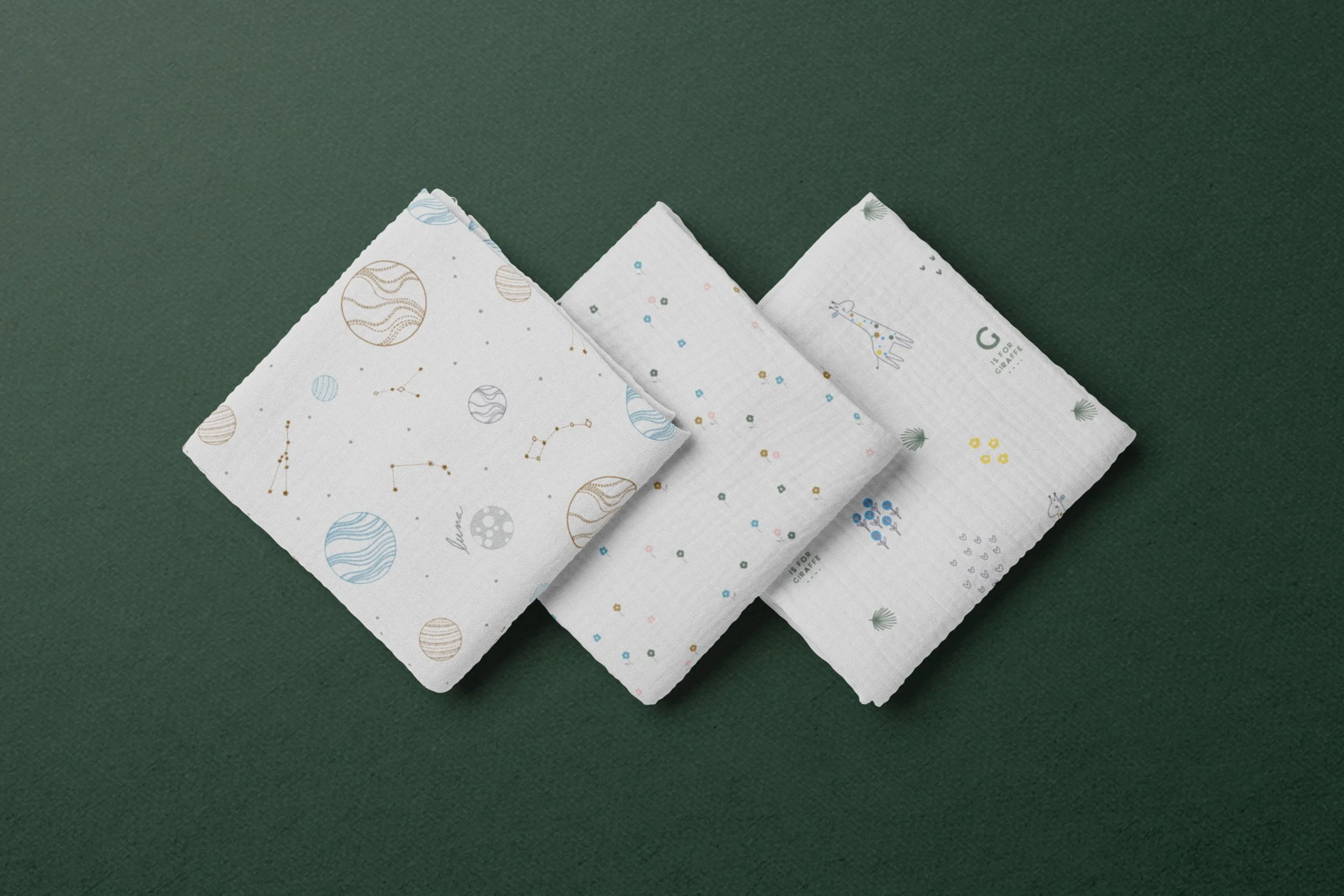
The cloth pattern designs began with carefully chosen stock illustrations, which were adapted and refined with original details to align seamlessly with the broader brand identity.
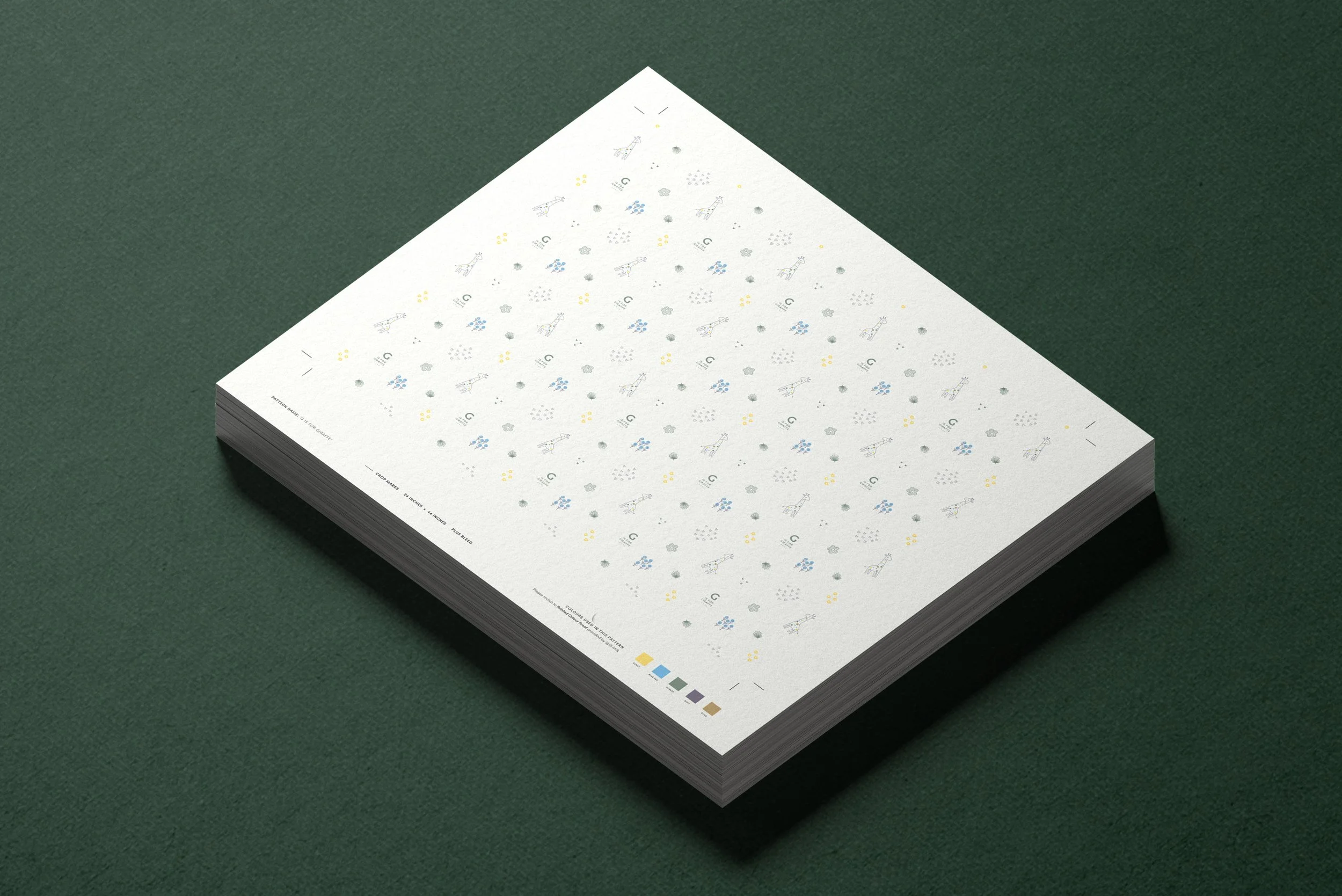
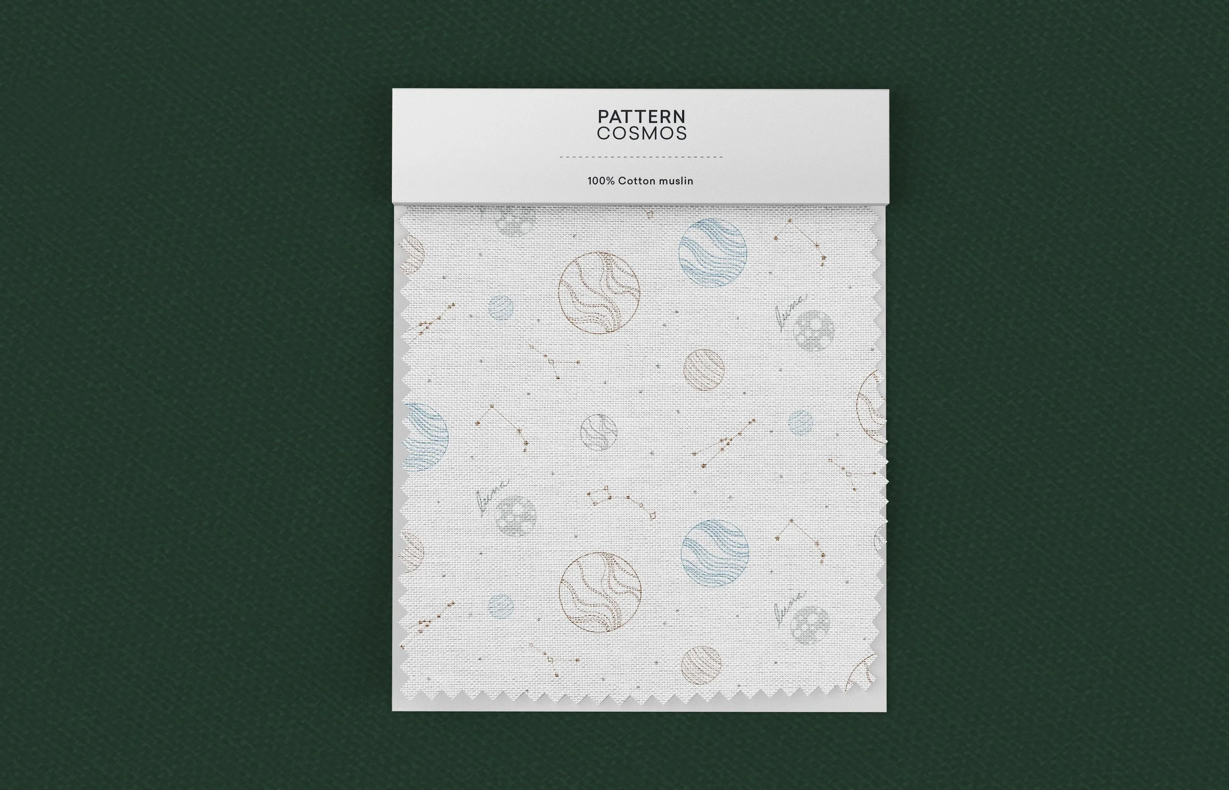
To support quality control during overseas production, a detailed print specification guide was created for the manufacturer in Korea. It included precise colour swatches and pattern references to help maintain the integrity of the design vision throughout production.
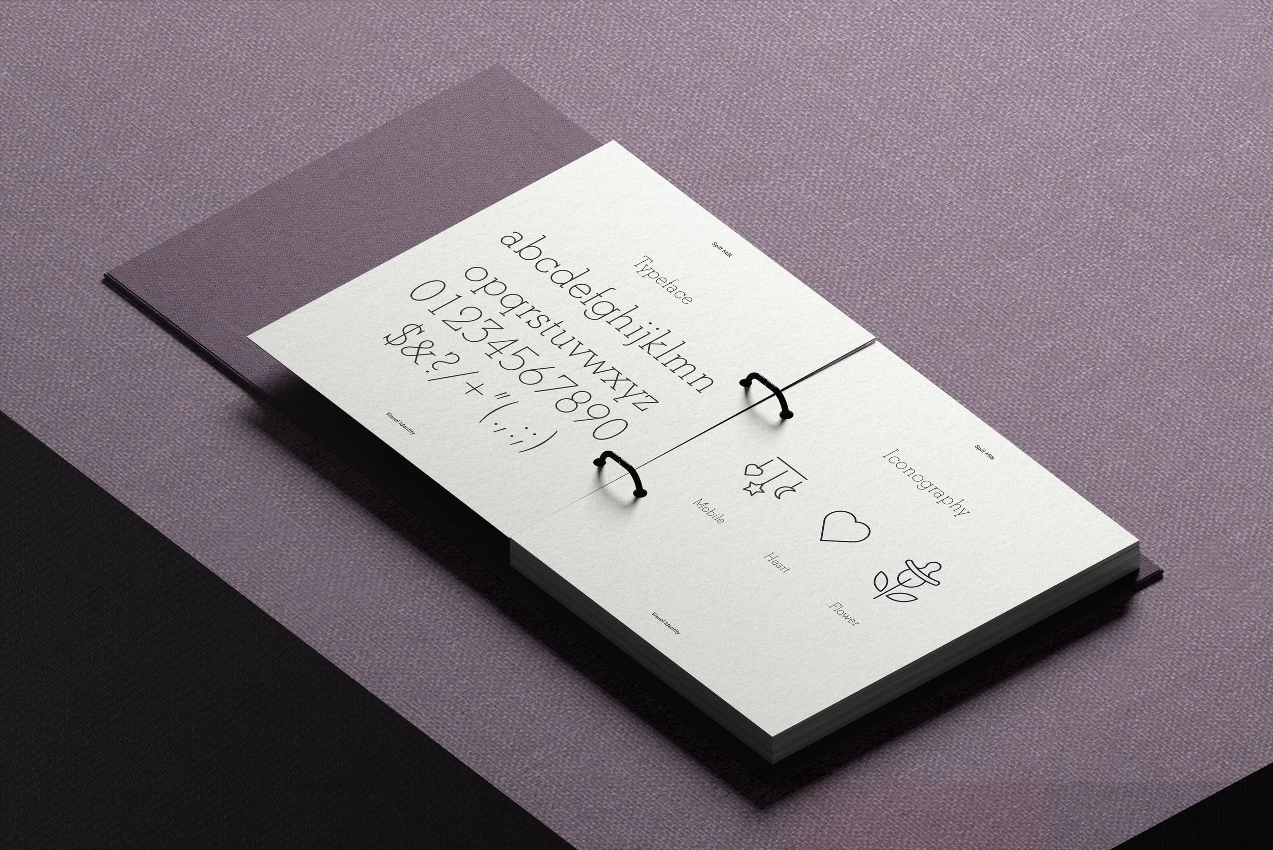
A careful balance of playfulness and a refined, modern aesthetic was central to the development of the visual system.
Building a distinct visual system was essential, achieved through the thoughtful and consistent application of colour, illustration, and iconography — extending seamlessly across every expression, from the cloth patterns to the packaging.
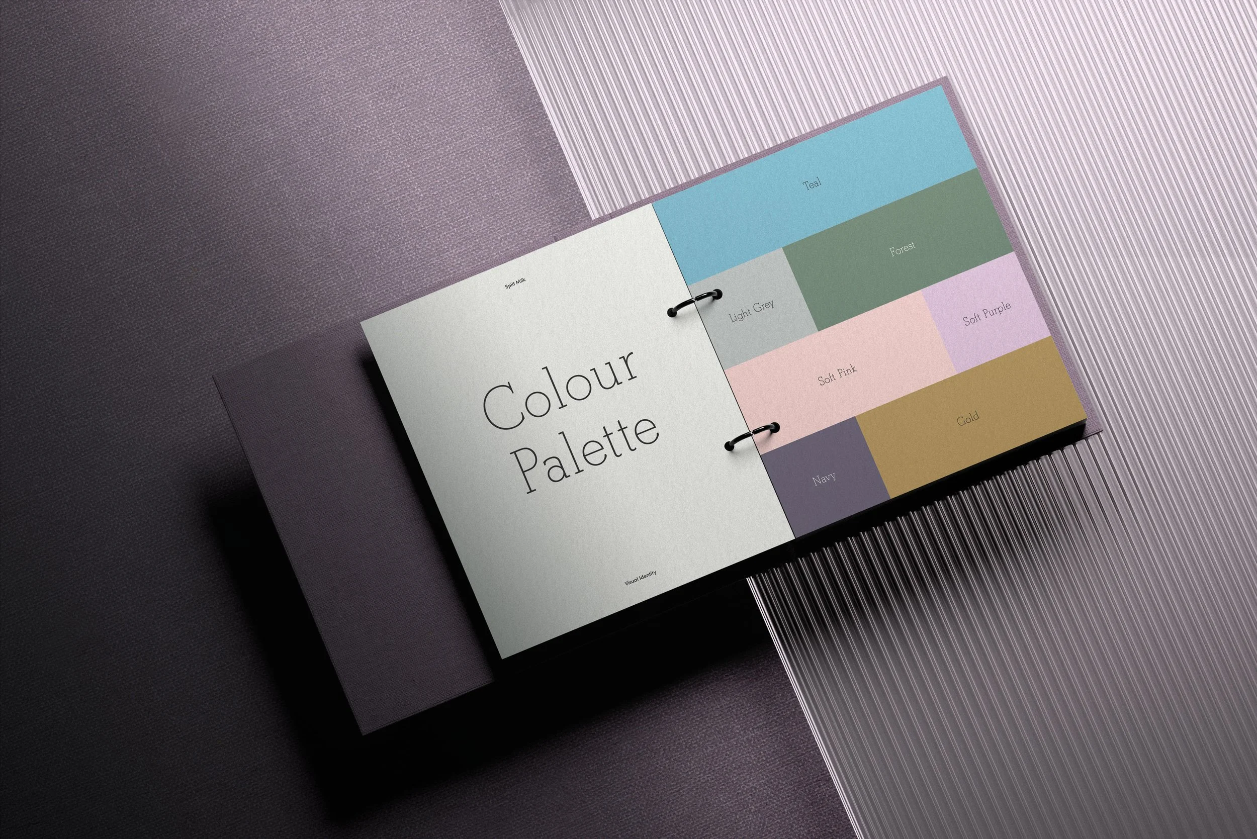
The colour palette draws inspiration from childhood toys and textiles — soft and warm hues offer a rich variety that brings visual interest and depth to the pattern designs and broader visual identity system.
Packaging

Inspiration for promotions
Custom iconography