InnerSpace (Case Study)
Visualizing a new era of sensor-free space utilization data – transforming complex, data-driven technology into clear, engaging visuals.
Through thoughtful visual storytelling and design, the visual system brings clarity to complex sensor-free space utilization data technology. Advanced analytics software is visualized into a brand experience that feels intuitive, insightful, and human.
The website design synthesizes the visual system with customized product features, clean typography, and a responsive layout that scales seamlessly across devices—complemented by a vibrant color palette that reinforces the brand.
The work began with concept development, focusing on a product-first approach—exploring how to visualize the technology in a way that feels intuitive, functional, and visually engaging.
Technical illustrations explain the technology in a clear, accessible way, fully integrated with the Innerspace design system.
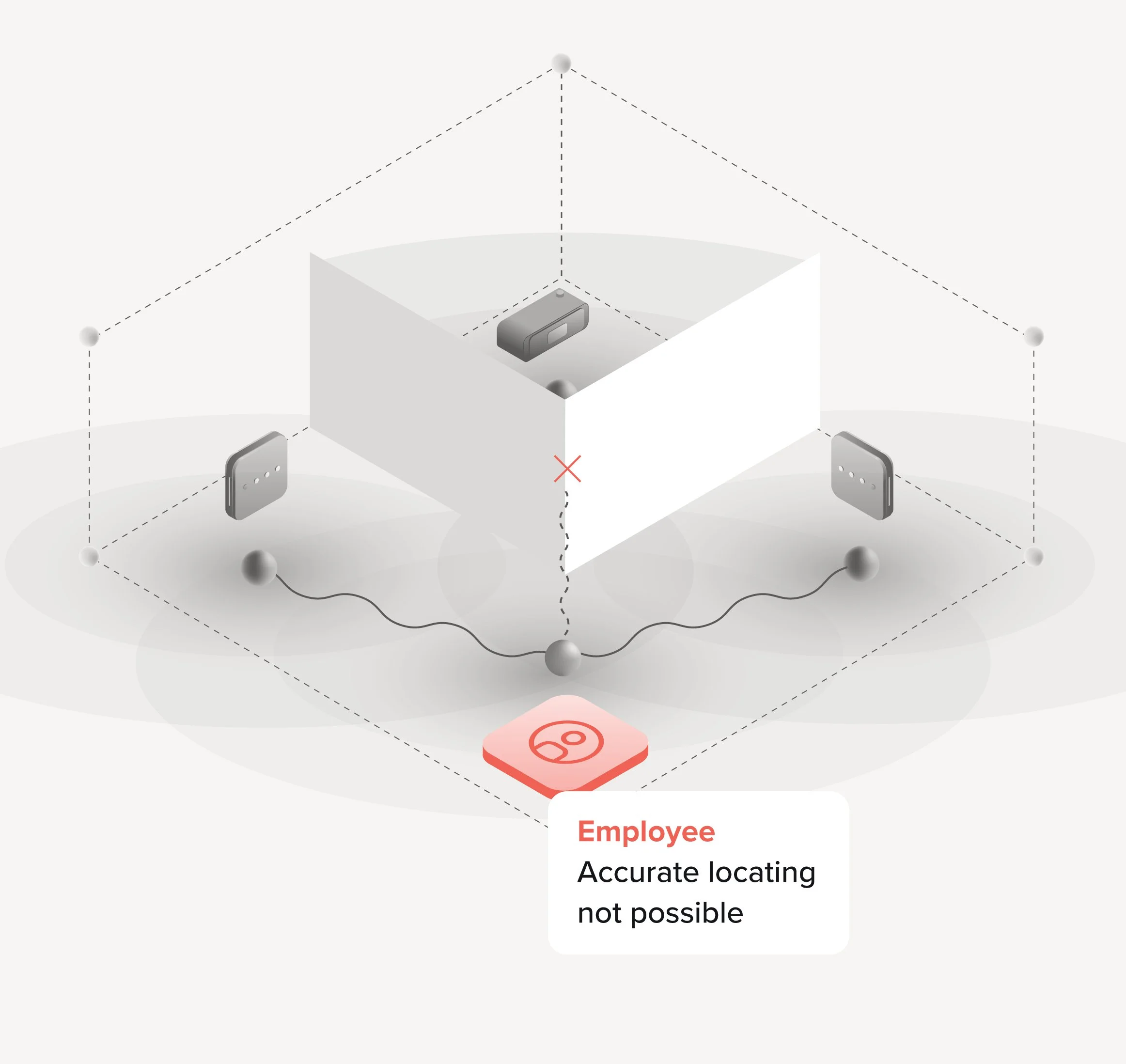
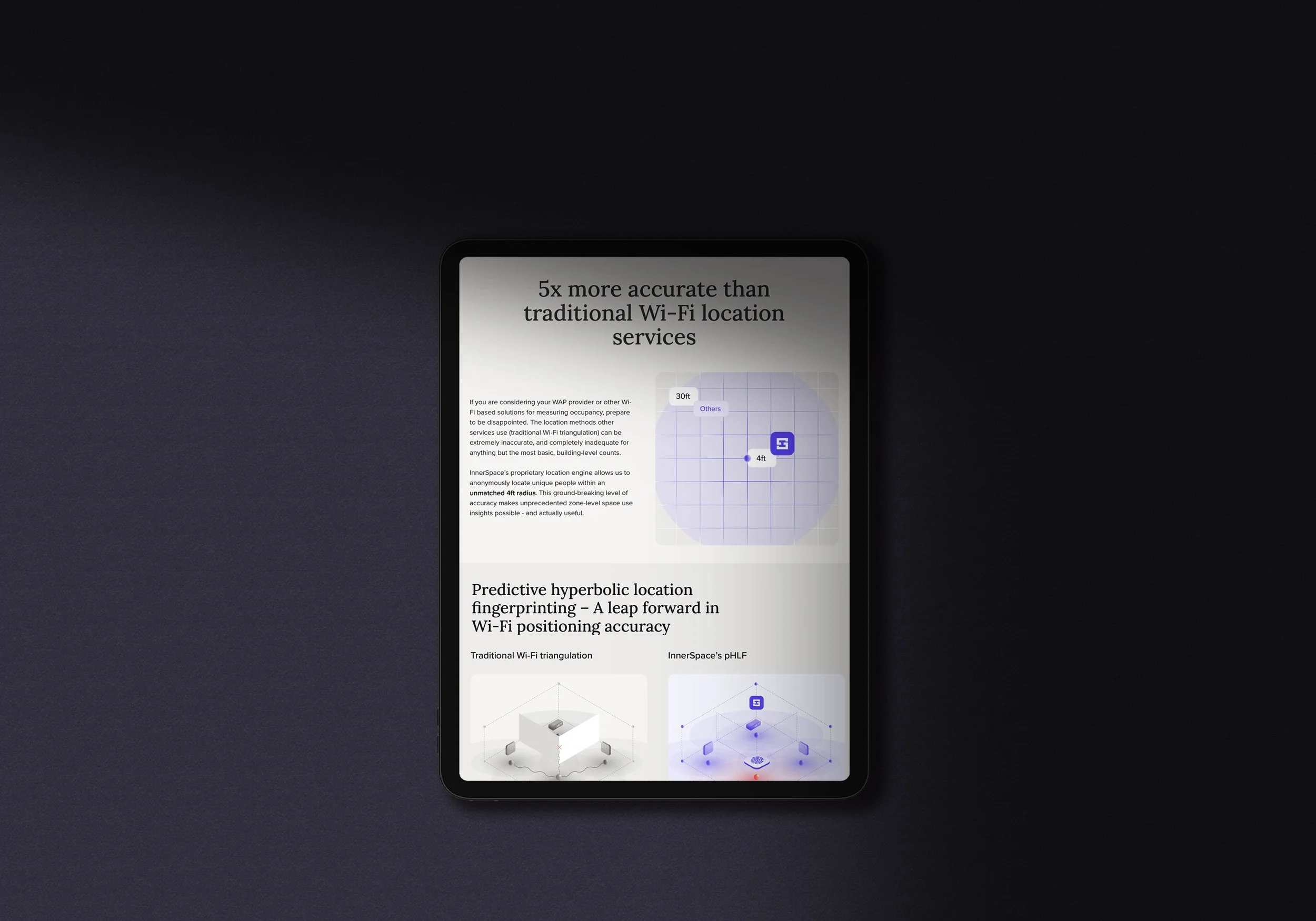
Visualizing the limitations of traditional technology
Visualizing the Innerspace technological advantage
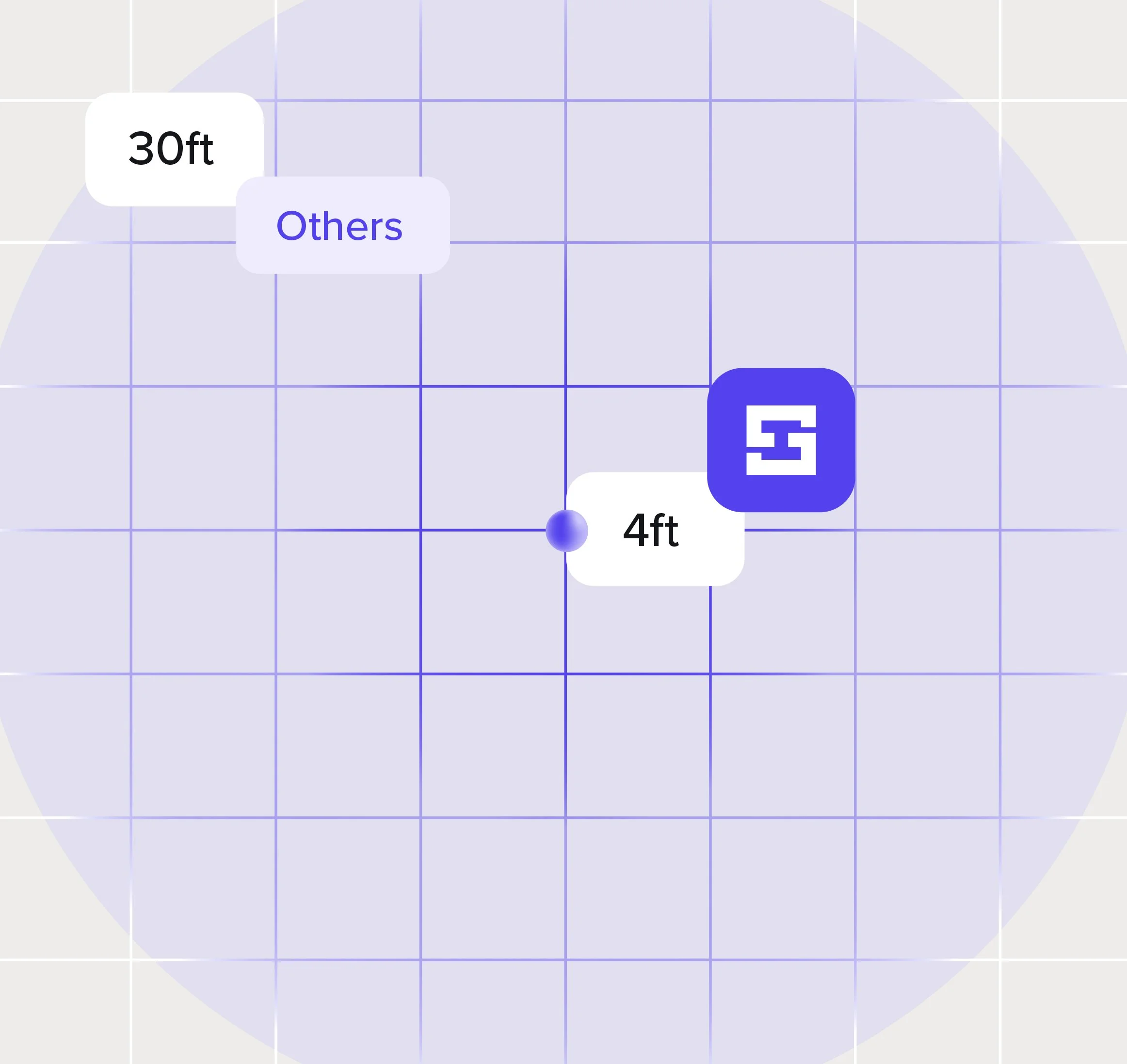
Visualizing the Innerspace accuracy advantage

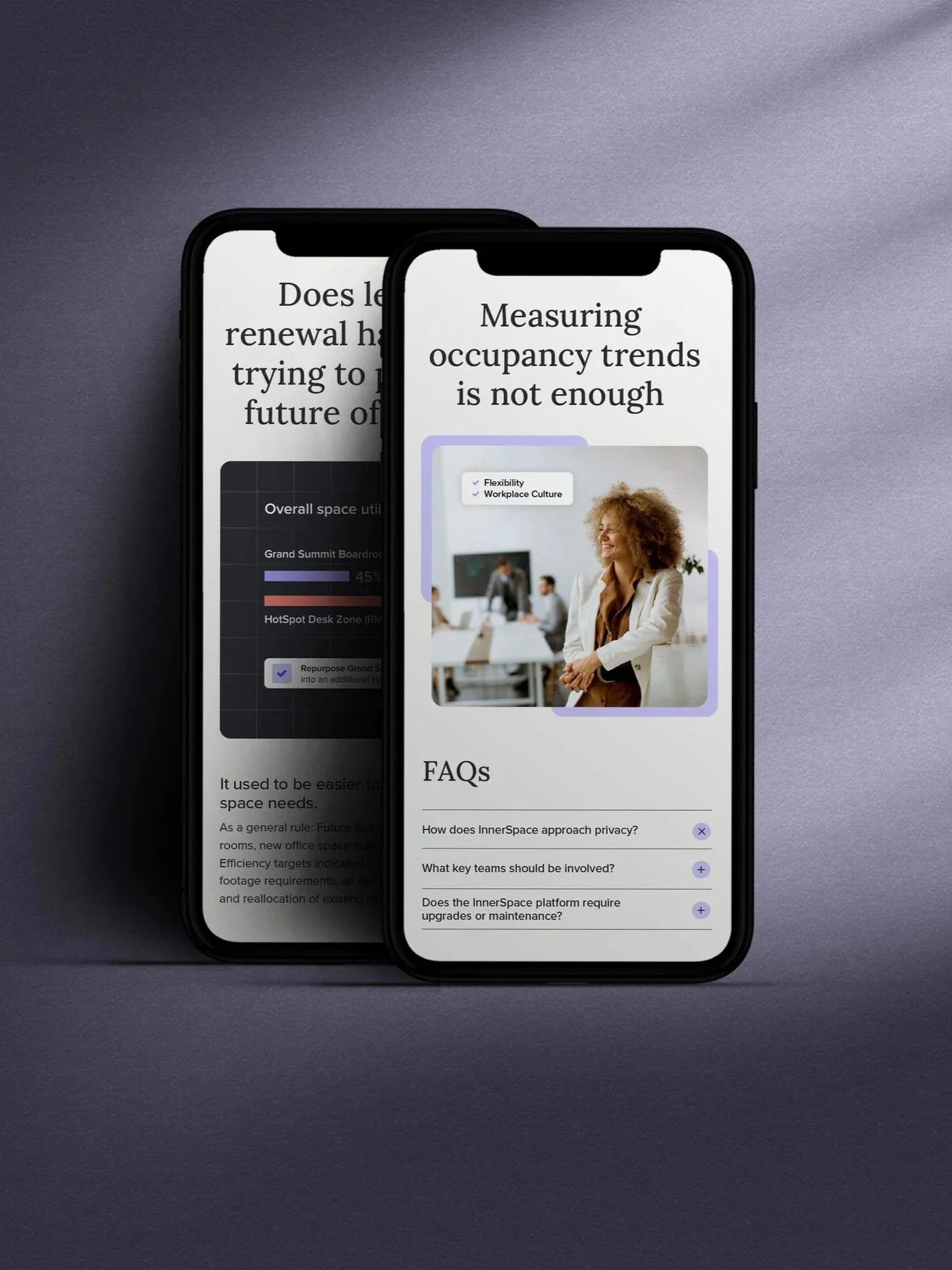
Extensive design research led to the selection of a modern serif font, an approachable visual tone that supports the complex nature of the technology without feeling cold or impersonal.
A product-first approach was a key principle driving the development of the visual system.
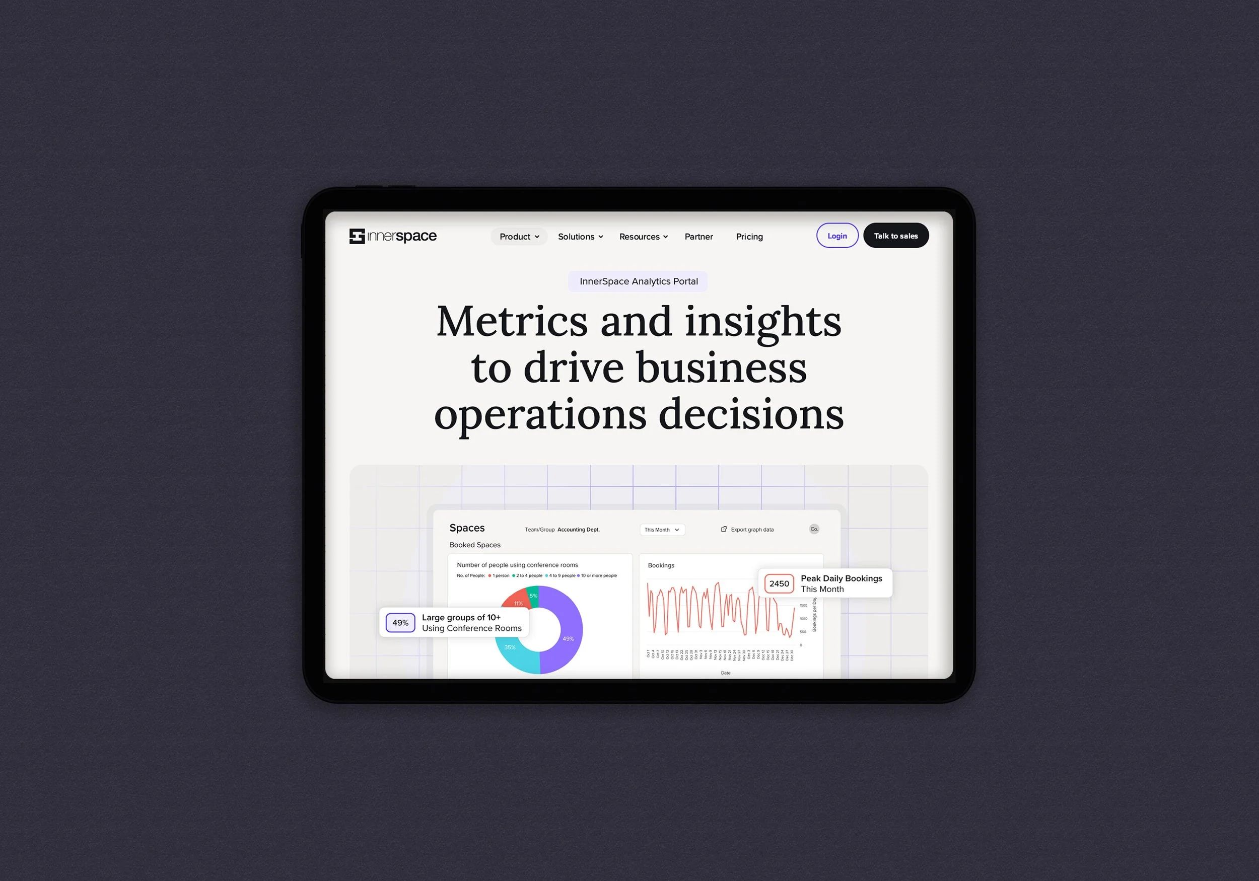
A crucial part of the InnerSpace conceptual work was determining how to present the digital product in a way that clearly communicates its functionality, how it works, and key features. The visuals include stylized screenshots with annotations and callouts, enhanced by subtle brand elements such as color blocks and pattern design.
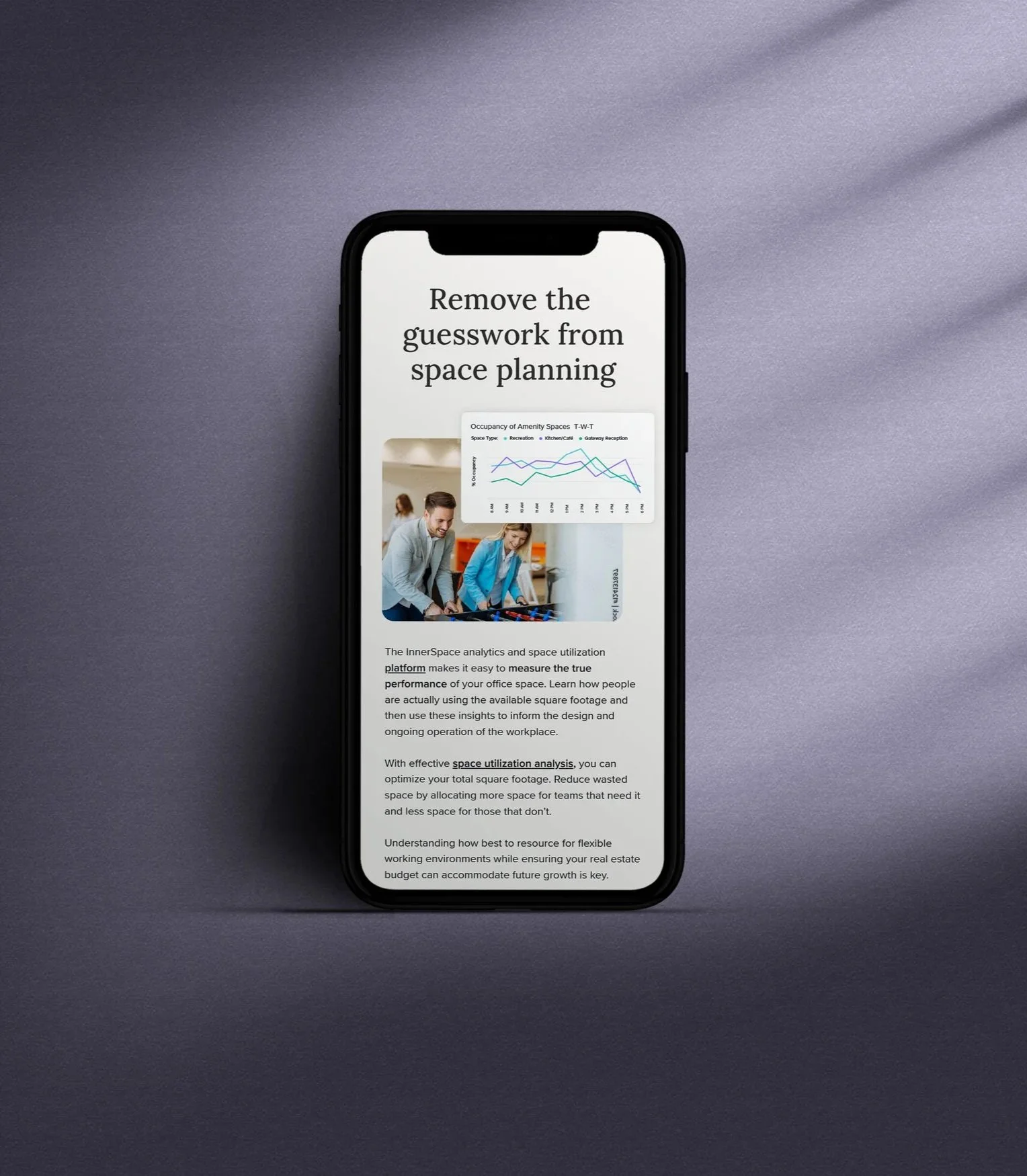

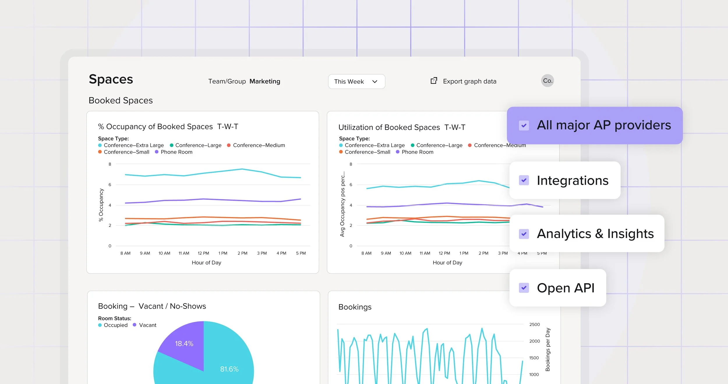
Cohesive feature product visuals highlight core functionality through clear annotations, purposeful typography and a refined colour palette and subtle grid texture to enhance depth, all while staying aligned with the product’s visual identity.
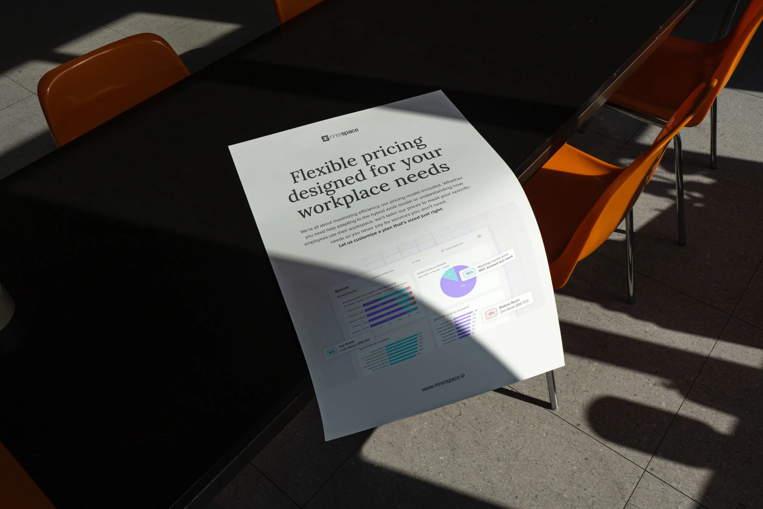
Modern colours, product features enhanced with brand customization, technical illustrations, and clean typography, are applied consistently, making the identity intuitive and flexible across social media campaigns, the website and other marketing needs.
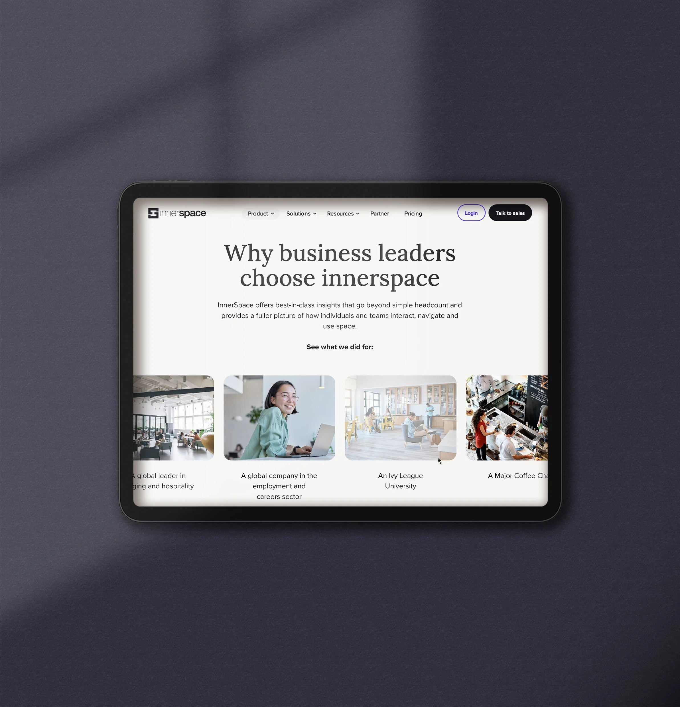

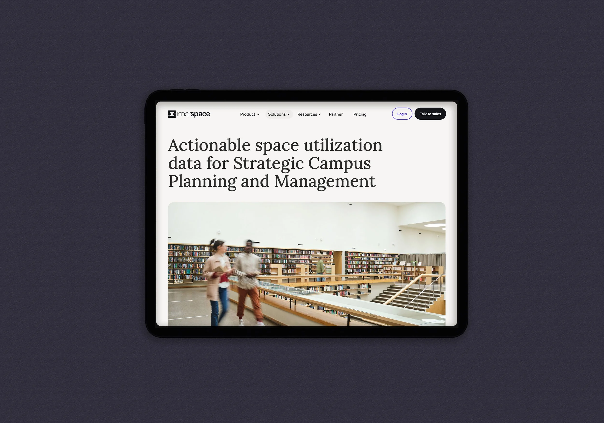
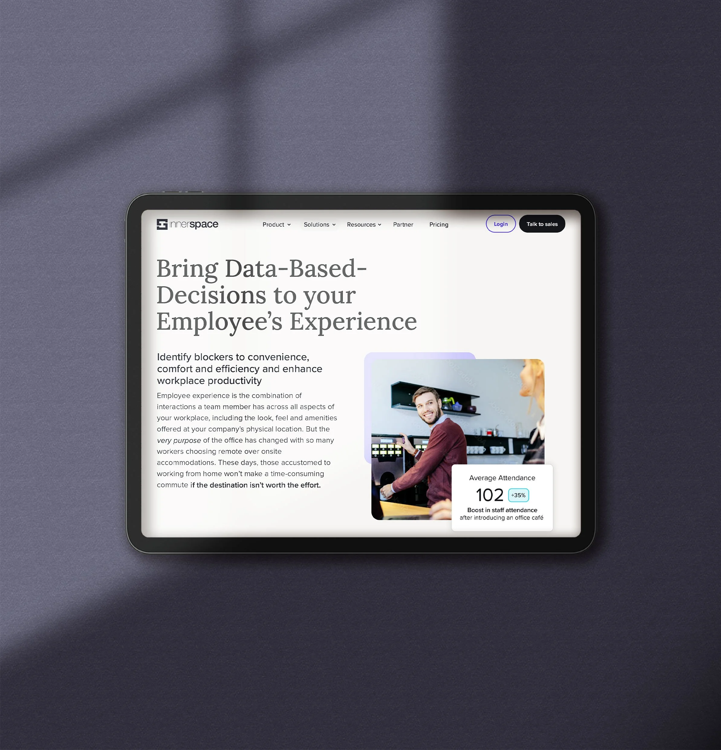
The website design synthesizes the visual system with carefully chosen stock photography that highlights the human element—people interacting with the space—complemented by clean typography and a vibrant color palette that reinforces the brand.