Envision (Case Study)
Visualizing a product that uses deep-tech solutions using artificial intelligence.
The new visual identity reflects Envision’s passion for creating intelligent products, but most importantly, products that are accessible and meaningful to their customers.
The intersection of art and science, the visual system draws inspiration upon Envision’s scientific approach to product design and creative problem solving.

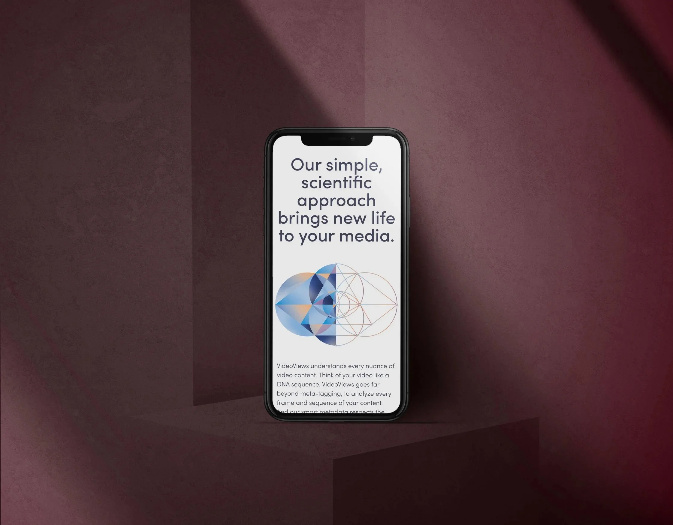
One of Envision’s key products is VideoViews, developed to help film production teams discover and monetize all of their video assets.


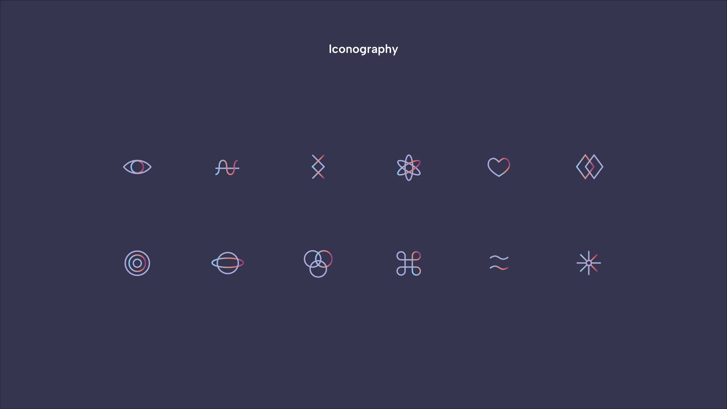
A sophisticated colour palette and clean typography are reminiscent of modern science journals and applied cohesively throughout the digital experience.
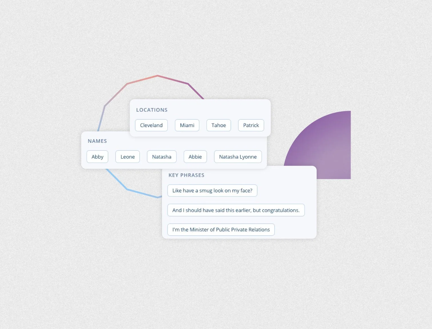
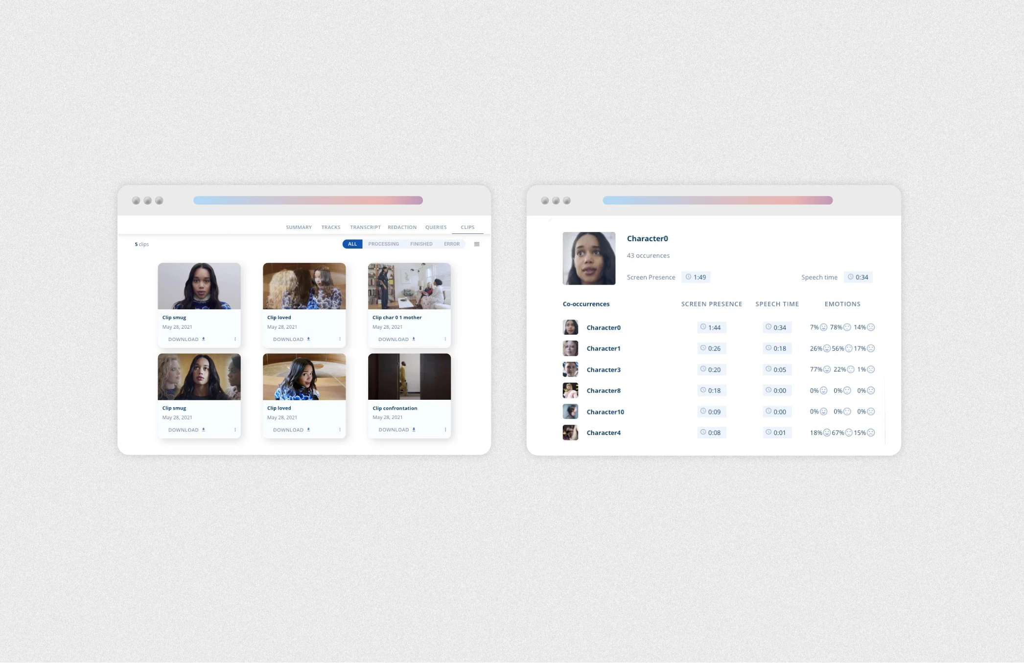
Cohesive product feature visuals were created to seamlessly align with the visual system—enhancing the product through thoughtful use of color, shapes and shadows.
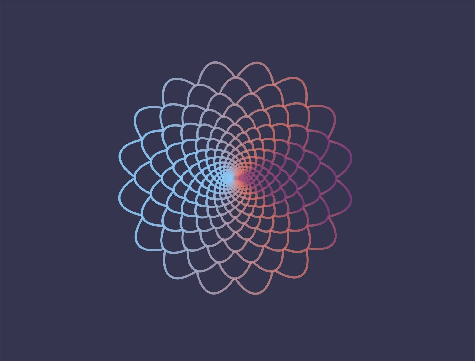
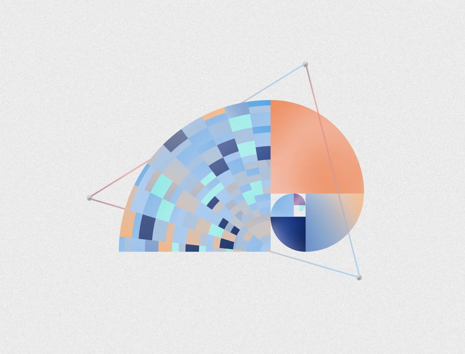
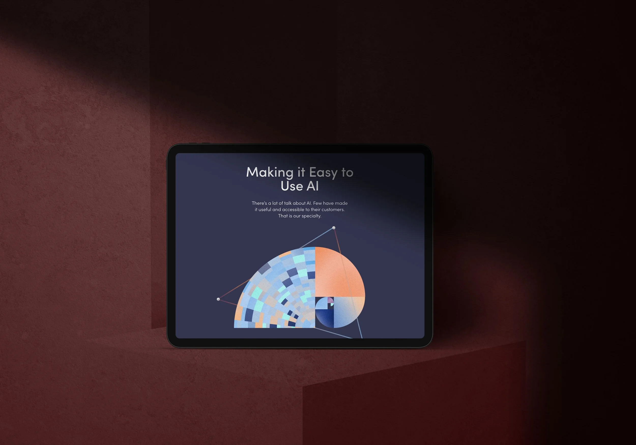
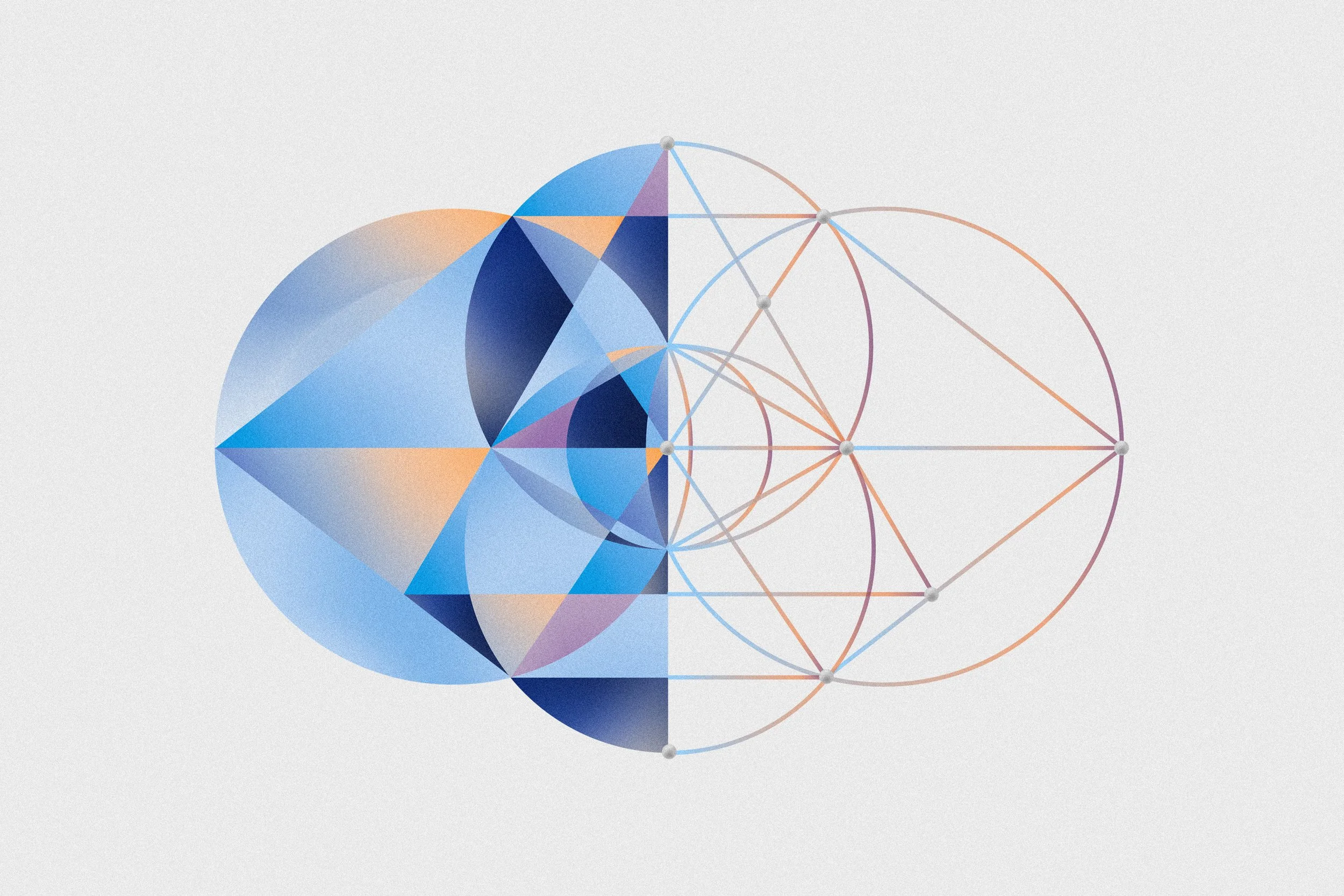
Building on Envision’s existing logo, various interpretations of the golden ratio are the building block of the visual system.
Customized illustrations depict complex visual patterns and aesthetic ideals and explore one of the most elegant mathematical proofs – the golden ratio. Layers of texture, shape and brand colours were applied to the illustrations resulting in distinct and memorable brand visuals.