
Spilt Milk Baby
Spilt Milk brings the 100% cotton gauze baby towel, an essential for Korean parents, to North America with an elegant and stylish twist that appeals to modern moms and dads as well as trendy baby product retailers.
Services:
Visual Strategy
Visual Identity
Art Direction
Pattern Design
Source Illustrations:
Creative Market

Visual Identity
The minimal and elegant visual identity was designed to complement the playful and vibrant patterns. A delicate logotype, stylish typeface, modern iconography, and a gender-neutral colour palette embody the Spilt Milk Baby client – a modern parent that is looking for both form and function.

Packaging Design
The translucent packaging material subtly reveals the cloth pattern designs inside. The design includes minimal typography and a restrained colour treatment so that the pattern designs take centre stage.
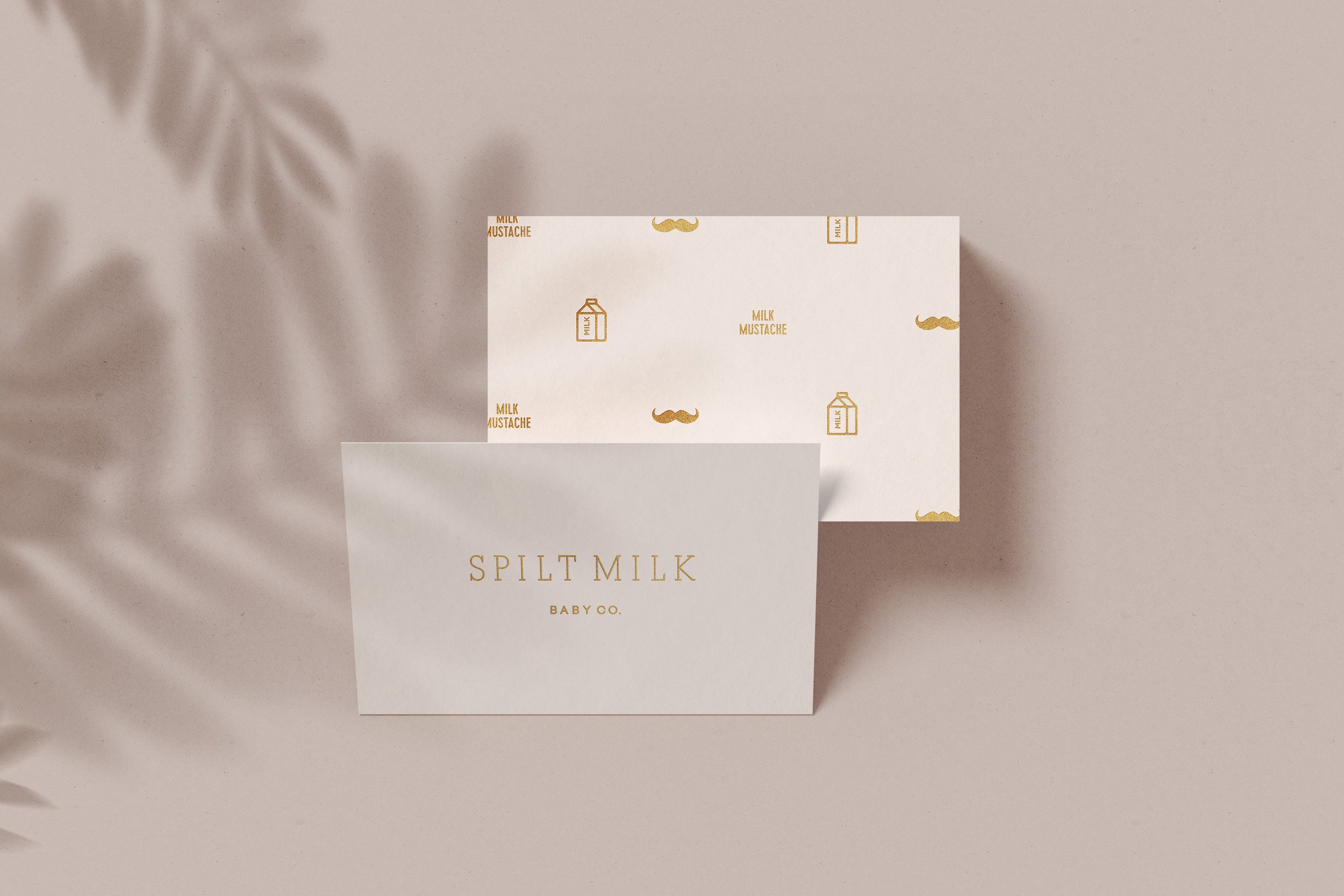
Wordmark Logo
The Spilt Milk Baby wordmark is a light-weight and delicate logotype. The tall letterforms and generous letter spacing create an overall modern aesthetic with a touch of whimsy. The logotype is extremely versatile when applied to various materials including packaging, print collateral, social media and digital applications.

Iconography
A series of simple icons including a pacifier-flower, heart, and crib mobile enhance the various implementations with playful and whimsical charm.

Patterns